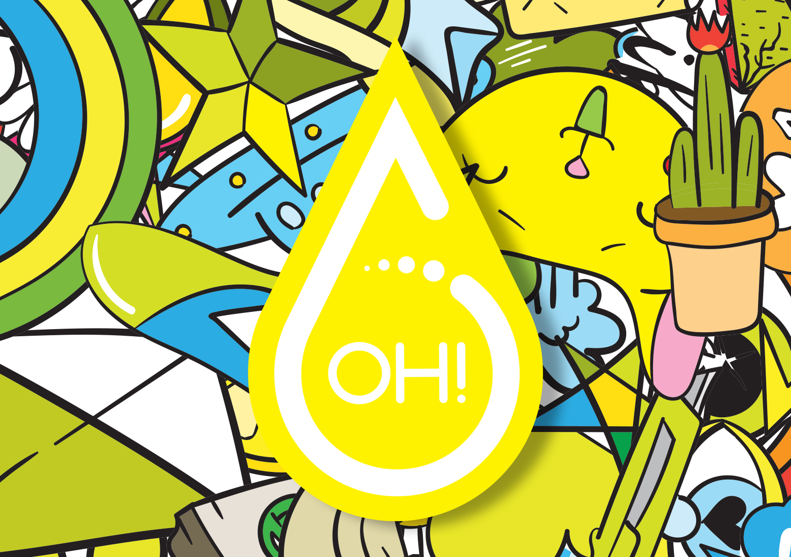
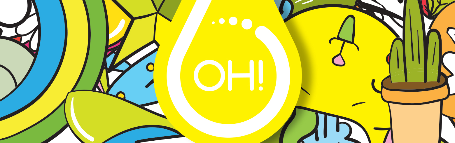
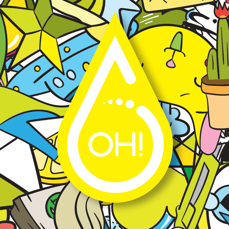
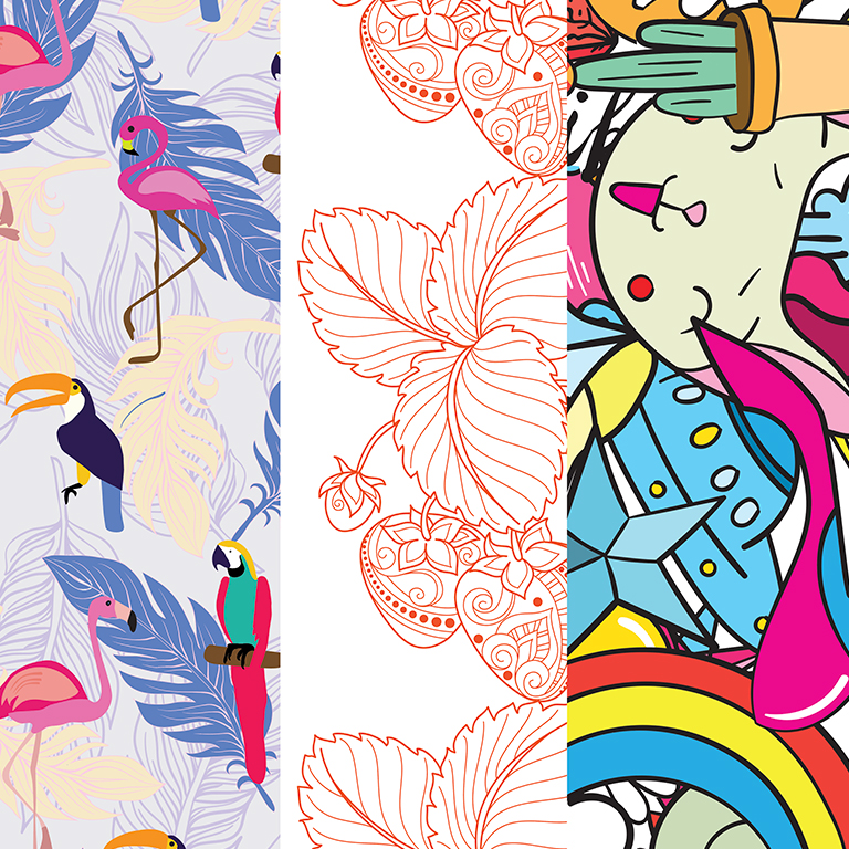
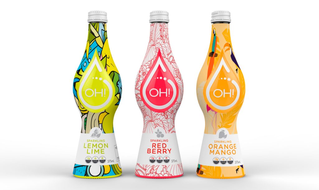
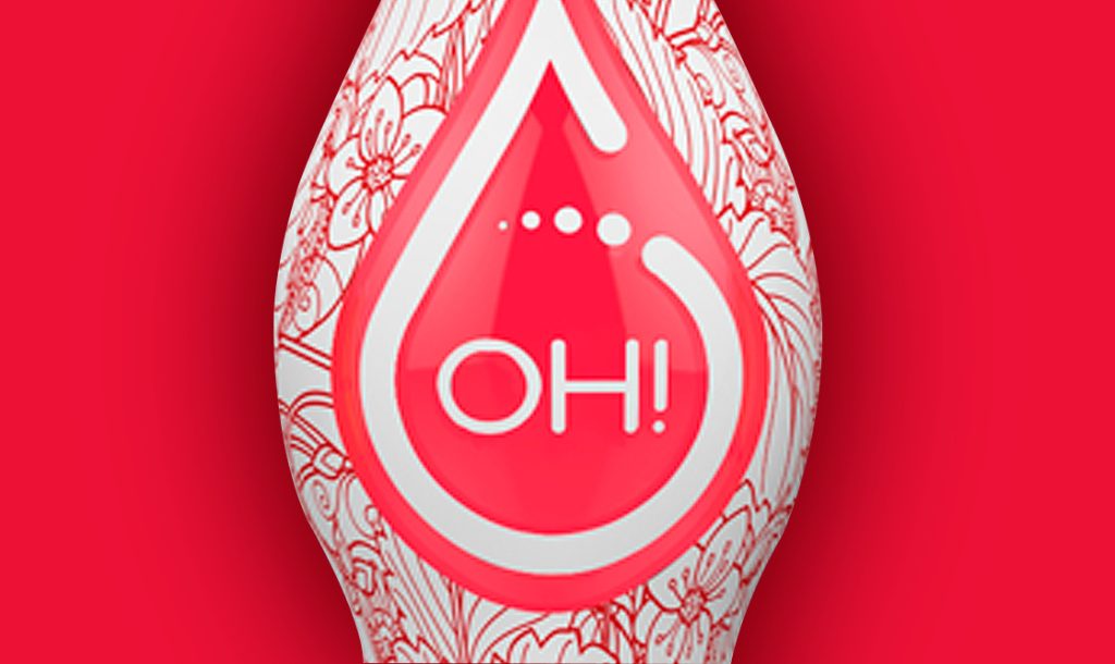
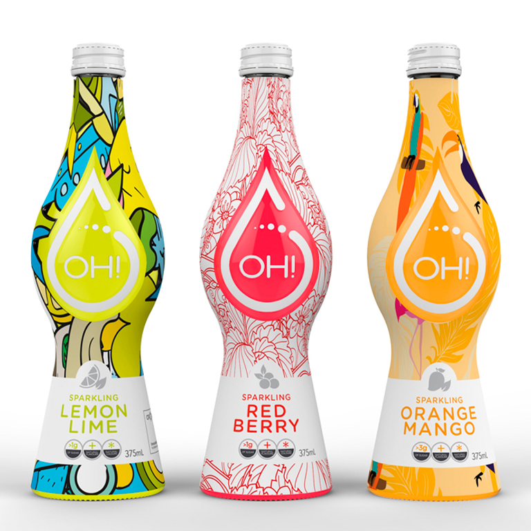
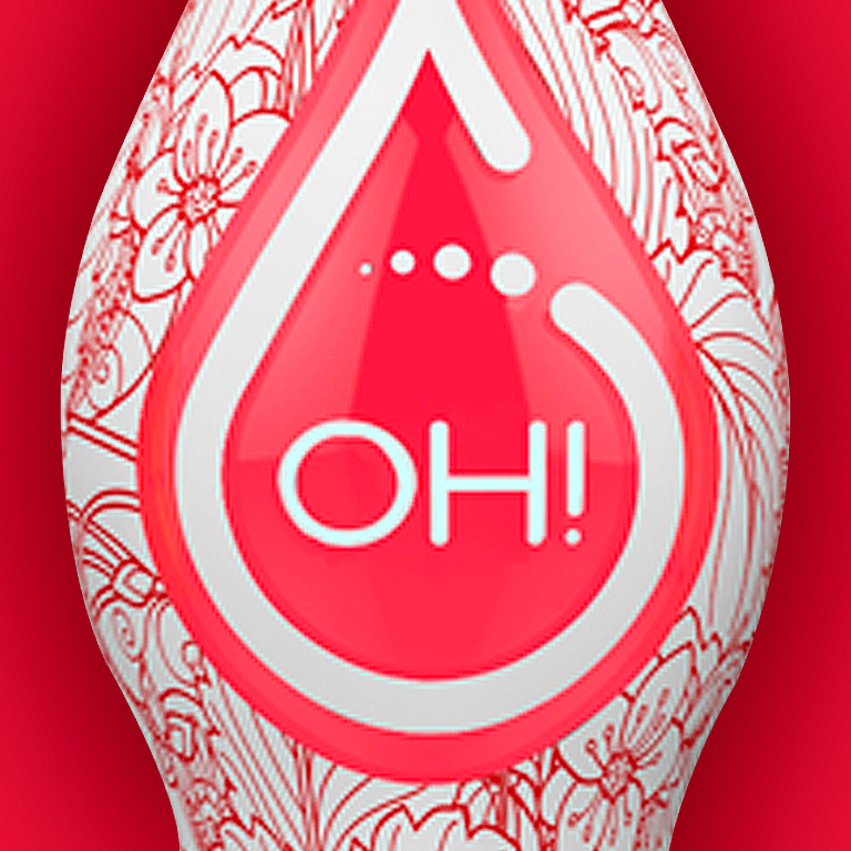
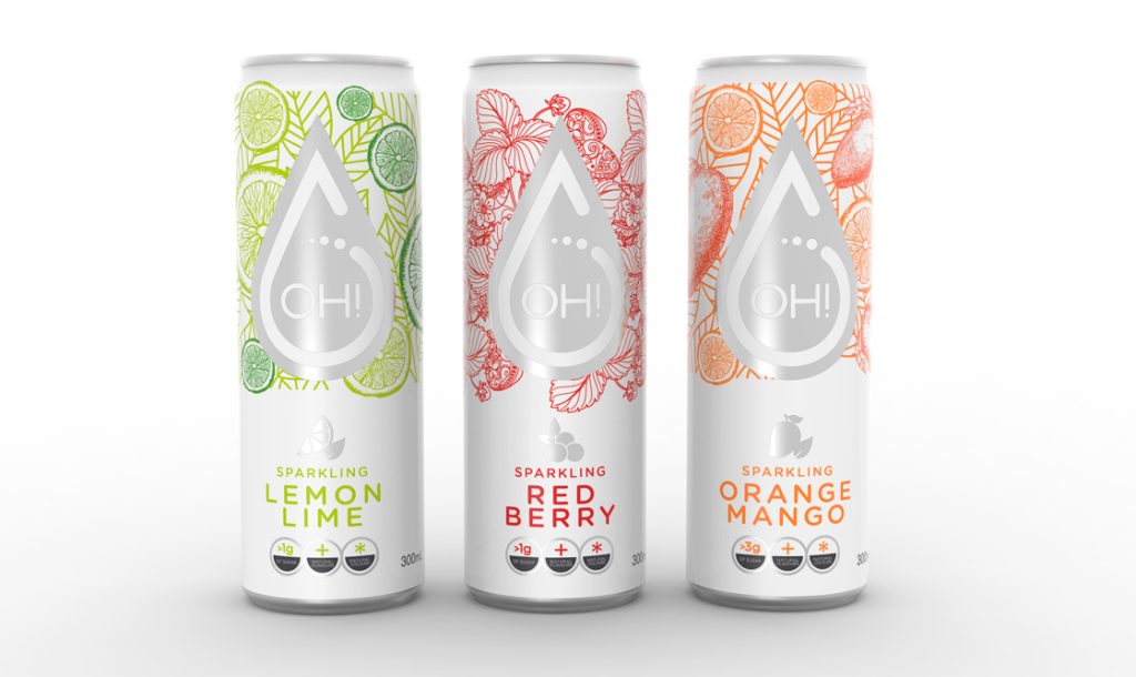
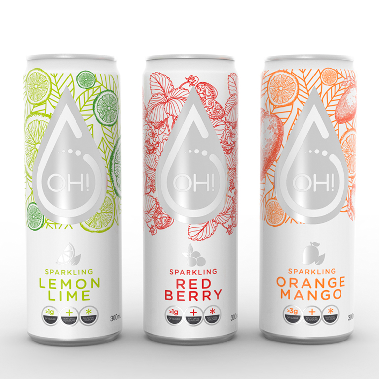
New logo and supporting brand language developed to complement Orora’s new bottle shape. Bold high colour graphics surround a tear shaped see through pannel. Allowing the consumer to see the product inside. The new brand mark sits neatly inside completing the pack construct.
Project Brief
Develope a new brand mark and pack designs to compliment Orora’s new bottle shape for the OH! Water range.
Deliverables
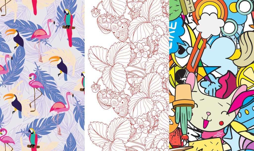
Bold designs which stand out from the crowd. New logo and supporting graphics which give an on trend choice of flavours.